Signage for the SLK Kliniken Heilbronn – cross-location, modular and identity-creating
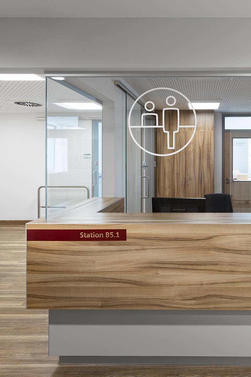
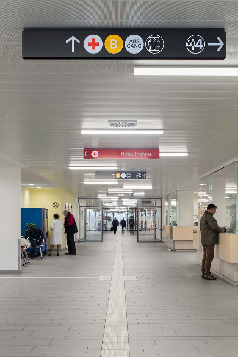
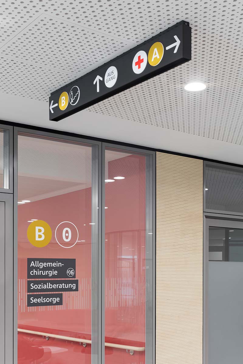
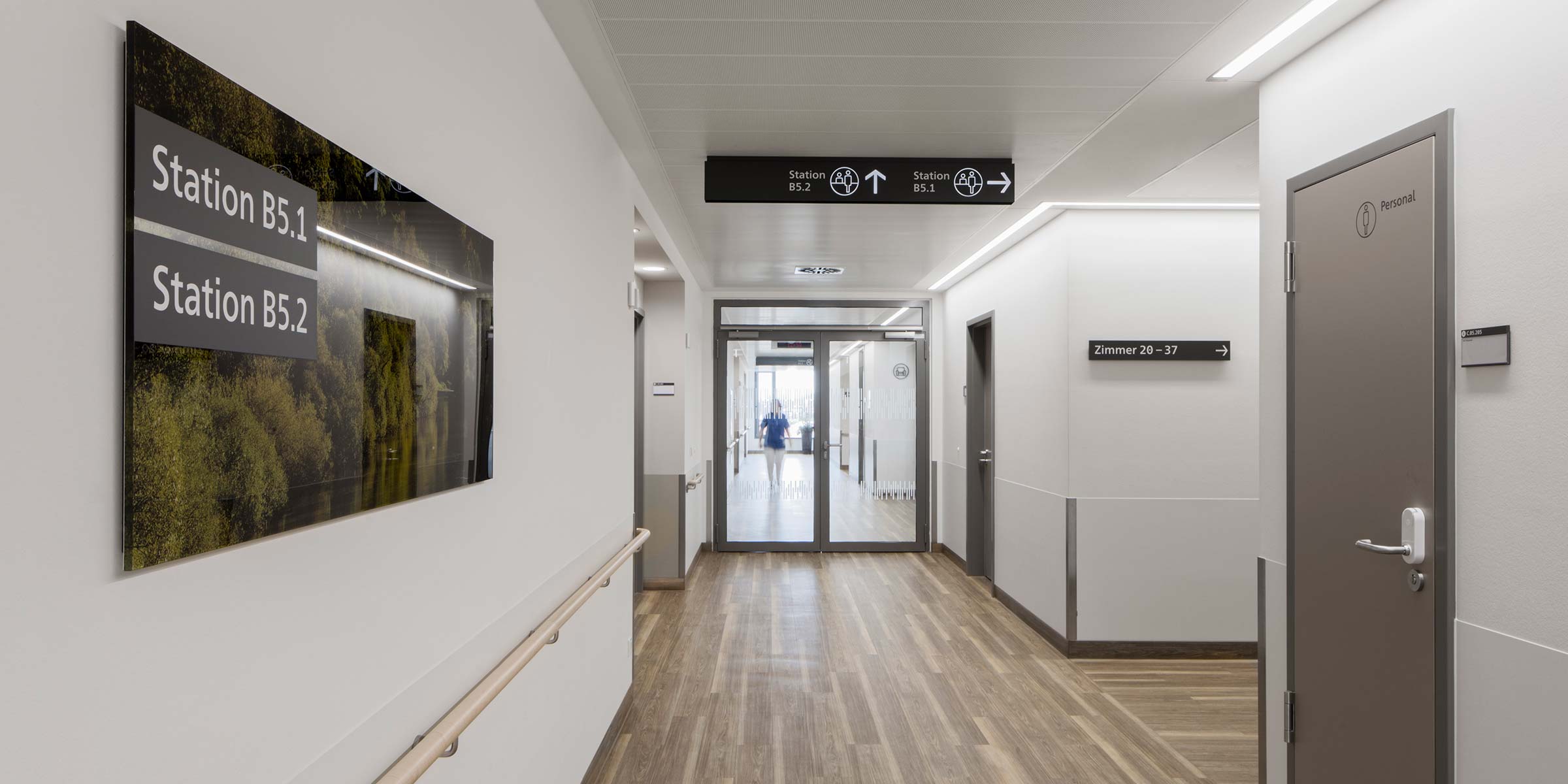
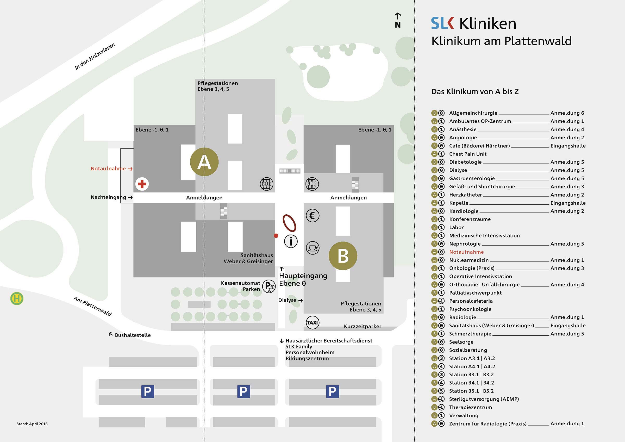
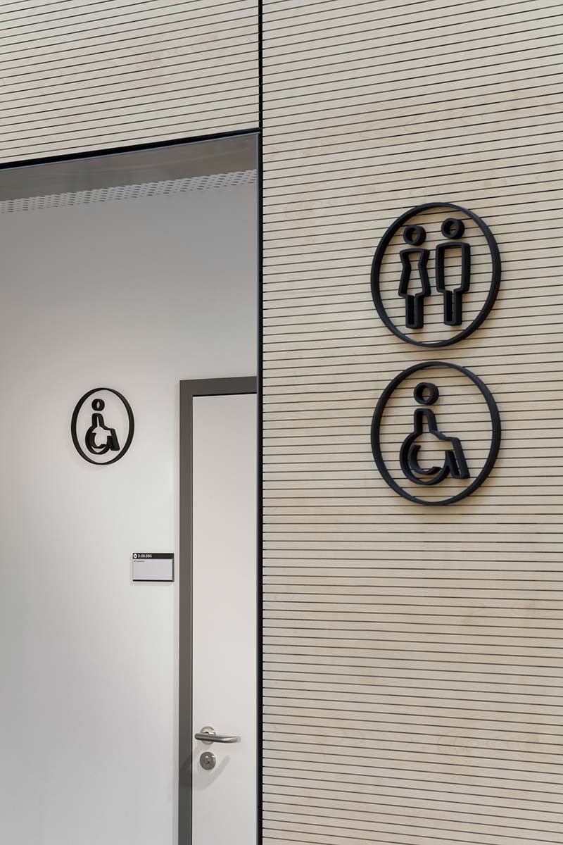
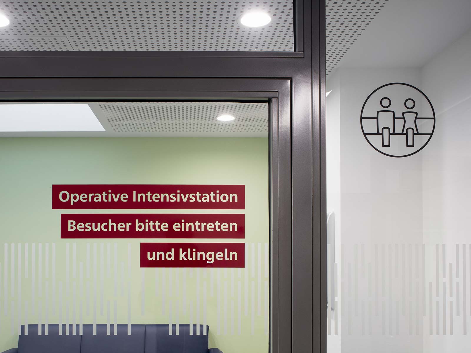
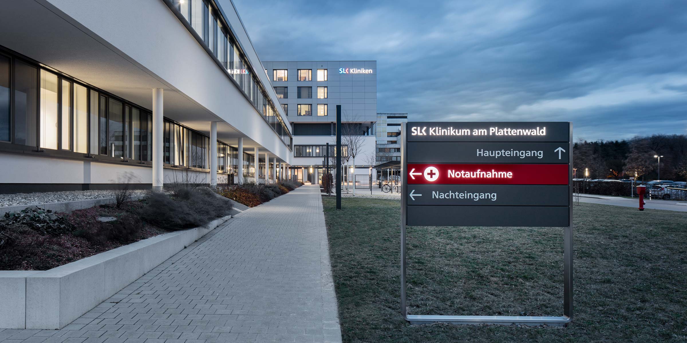
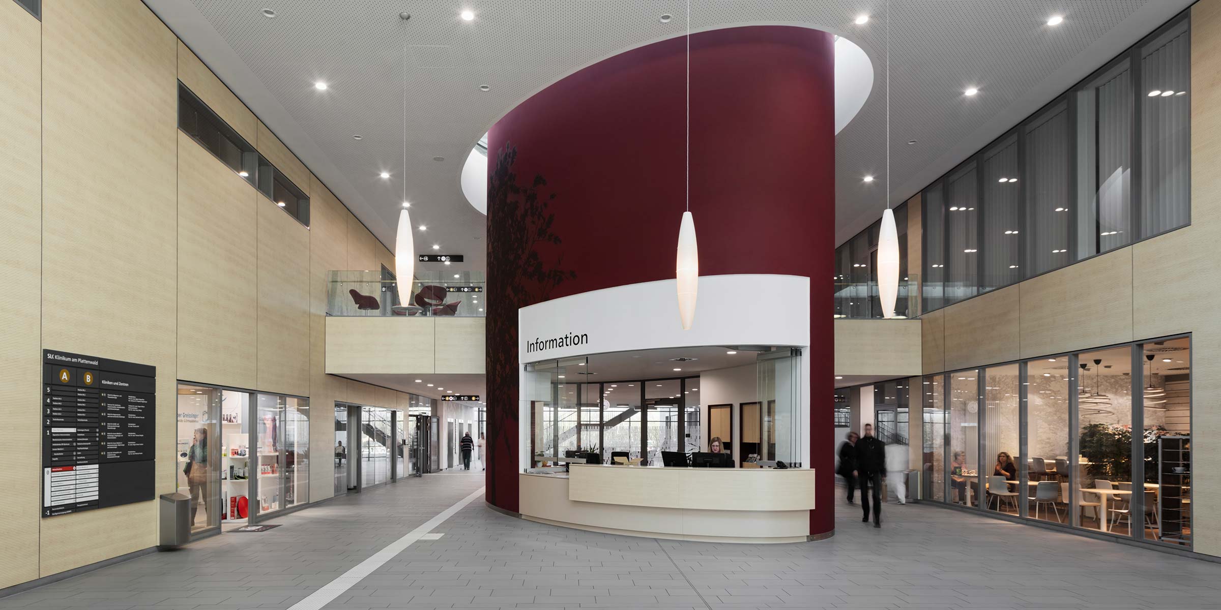
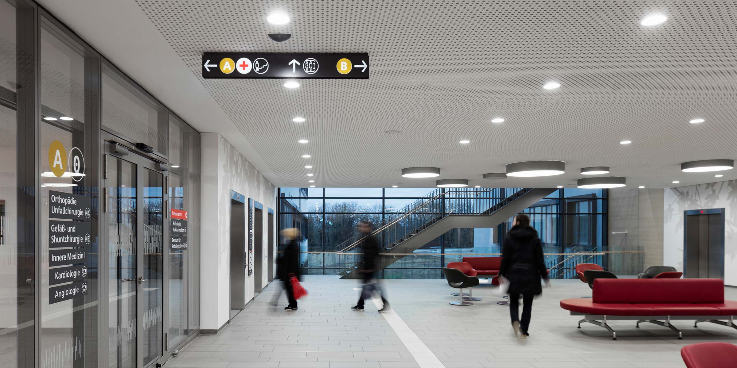
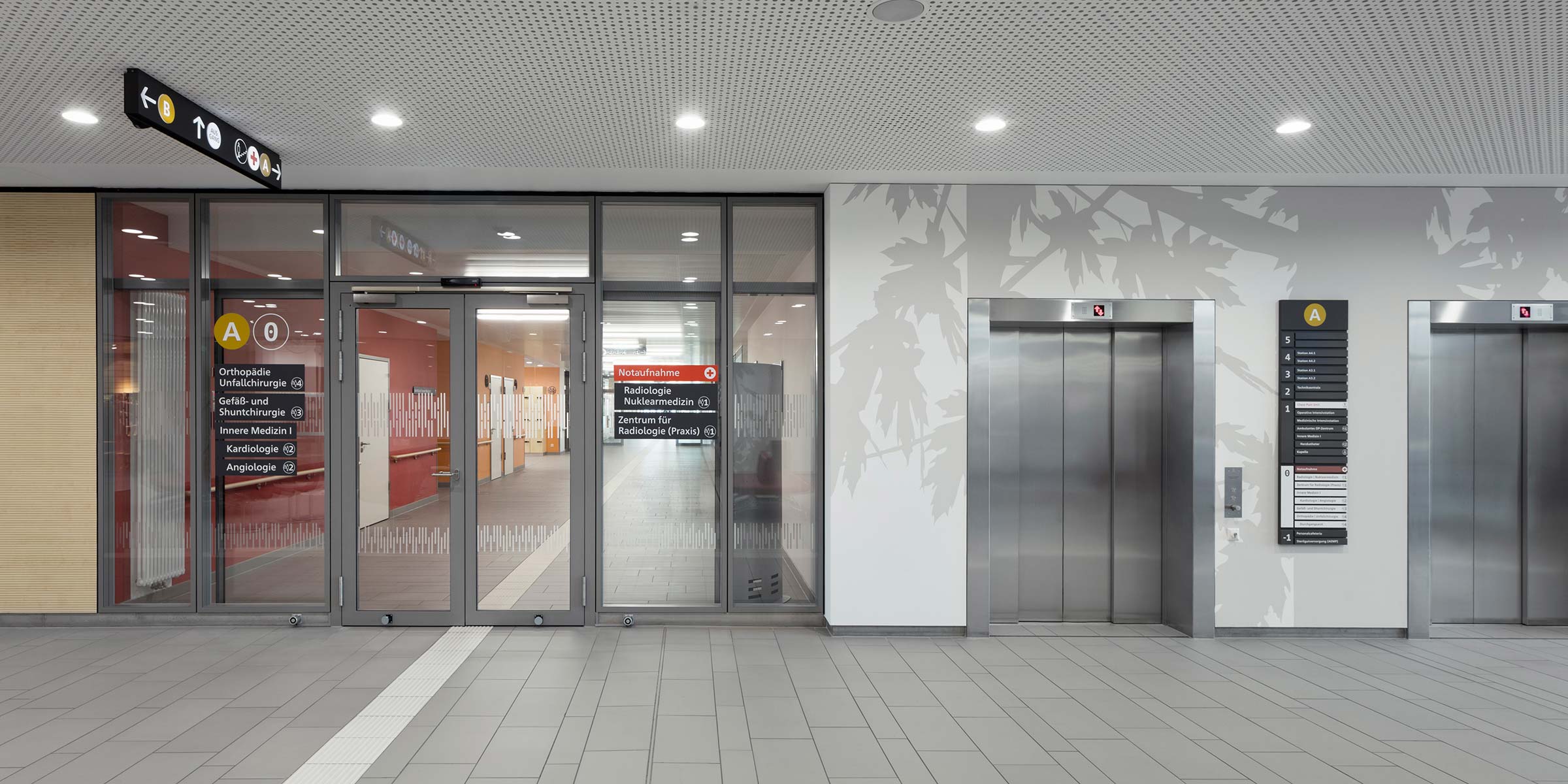
Significant investments are being made in the structural and medical infrastructure of SLK Kliniken at several locations. The growth of the SLK clinics with the takeover of existing facilities and the new construction or expansion of existing sites required an overarching strategy for the brand and the appearance of the SLK clinics, which was developed across sites and identity as a superordinate design concept for about 7 clinics at individual sites modular and was implemented in a first step at 2 locations. The structural corporate design defines a new universal design principle for the SLK Kliniken, which can be transferred to all SLK Kliniken locations. The concept is innovative because it applies strategies of complex urban systems and infrastructure projects to a clinic group for the first time and combines this with a high-quality design approach in 17 element groups. Typography and self-developed pictograms give the corporate design character, the buildings identity and users recognition. The typeface „Neue Frutiger 1450“ is the first typeface created in 2013 based on the new regulation on barrier-free reading, DIN1450, and was applied here. The font was involved in the adoption of the corporate logo and communication materials and received the typography and colors proposed in the CD.
Signage as corporate design for the SLK Kliniken Heilbronn – Klinikum at Plattenwald Bad Friedrichshall
Client
SLK Clinics Heilbronn
Competition
Invitation Beate Kling Architekten
Beate Kling Architekten with KSV Krüger Schuberth Vandreike
1st prize 2014
Realization
Working group KSV Kling Signaletik
Beate Kling, Torsten Krüger, Geraldine Hellmann, Katharina Zettl, Thomas Uhlig,
Thomas Richter, Ebru Beyazgül
Realization period
Planning 2014
Execution
2015 – 2016
Photographer
Werner Huthmacher
